Stylr
Stylr
Stylr
A Sustainable Fashion Shopping App
A Sustainable Fashion Shopping App
A Sustainable Fashion Shopping App
Year
2026
Company
Personal
Category
UI/UX Design
Product Duration
1-week

The Brief
Fast fashion is easy. Making a better choice shouldn't be hard.
Fast fashion is easy. Making a better choice shouldn't be hard.
Fashion apps make it effortless to buy more, more often. What they don't do is make it easy to buy well, to know if a product is actually sustainable, or if a purchase is doing any good beyond your wardrobe.
Stylr is built for the shopper who wants to dress well without the guilt. My job was to design a shopping experience where sustainability isn't a filter you apply, it's the default the app is built around.
Fashion apps make it effortless to buy more, more often. What they don't do is make it easy to buy well, to know if a product is actually sustainable, or if a purchase is doing any good beyond your wardrobe.
Stylr is built for the shopper who wants to dress well without the guilt. My job was to design a shopping experience where sustainability isn't a filter you apply, it's the default the app is built around.

Approach
I designed shopping as the reward system, not a separate one bolted on top.
I designed shopping as the reward system, not a separate one bolted on top.
Most sustainable fashion apps treat eco-consciousness as a badge or a filter tucked into settings. That framing makes sustainability optional. I flipped it: every product surfaces its material origin and impact by default, and every action that supports a better choice (buying organic, choosing recycled, redeeming points) is folded into a single, visible rewards system, so doing good and shopping well are the same loop.
Most sustainable fashion apps treat eco-consciousness as a badge or a filter tucked into settings. That framing makes sustainability optional. I flipped it: every product surfaces its material origin and impact by default, and every action that supports a better choice (buying organic, choosing recycled, redeeming points) is folded into a single, visible rewards system, so doing good and shopping well are the same loop.
Key Decisions
Points as feedback, not a separate program. Every product tag (Organic, Recycled, Tencel) carries a points value shown at the point of decision, not after checkout.
Points as feedback, not a separate program. Every product tag (Organic, Recycled, Tencel) carries a points value shown at the point of decision, not after checkout.
A tiered journey, not a flat leaderboard. Seed → Sprout → Forest gives points a sense of progression, similar to how streaks work in habit apps.
A tiered journey, not a flat leaderboard. Seed → Sprout → Forest gives points a sense of progression, similar to how streaks work in habit apps.
Impact made tangible. CO2 saved and trees planted are shown in real units at checkout, not abstract scores — so the reward feels connected to something real.
Impact made tangible. CO2 saved and trees planted are shown in real units at checkout, not abstract scores — so the reward feels connected to something real.
Visual Direction
Visual Direction
A lighter shade of sustainable.
A lighter shade of sustainable.
Most sustainability-led apps default to earthy greens and browns, which can read as "crunchy" rather than stylish. Stylr uses a soft lavender-to-white gradient with mint green and pink accents instead, closer to a modern D2C shopping app than an eco-brand, so sustainability feels like a natural fit for the product, not the whole personality of it.
Identity and rewards screens (Profile, Rewards) shift to a dark near-black theme, treating loyalty status the way premium membership apps do, a small visual cue that this part of the app is about your standing, not just browsing.
Most sustainability-led apps default to earthy greens and browns, which can read as "crunchy" rather than stylish. Stylr uses a soft lavender-to-white gradient with mint green and pink accents instead, closer to a modern D2C shopping app than an eco-brand, so sustainability feels like a natural fit for the product, not the whole personality of it.
Identity and rewards screens (Profile, Rewards) shift to a dark near-black theme, treating loyalty status the way premium membership apps do, a small visual cue that this part of the app is about your standing, not just browsing.

Key Flows
Key Flows
Onboarding & profile setup
Onboarding & profile setup
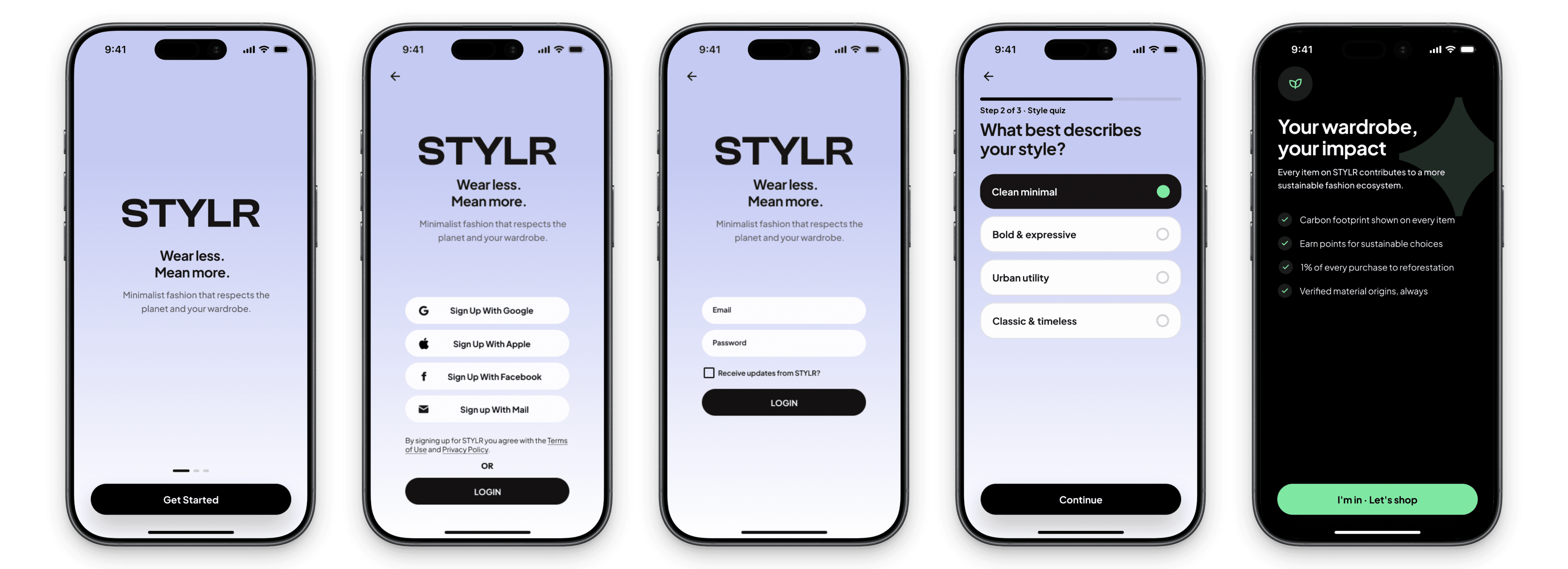
A short style quiz (Clean Minimal, Bold & Expressive, Urban Utility, Classic & Timeless) followed by a one-screen explainer on how the app tracks impact, carbon footprint, sustainable sourcing, reforestation contribution, before the user ever sees a product.
A short style quiz (Clean Minimal, Bold & Expressive, Urban Utility, Classic & Timeless) followed by a one-screen explainer on how the app tracks impact, carbon footprint, sustainable sourcing, reforestation contribution, before the user ever sees a product.
Checkout & Rewards
Checkout & Rewards
A three-step checkout (Address, Payment, Confirm) that shows points earned and impact saved before the user completes the order, plus a dedicated Rewards screen with tier progress, earned badges, and active shopping passes.
A three-step checkout (Address, Payment, Confirm) that shows points earned and impact saved before the user completes the order, plus a dedicated Rewards screen with tier progress, earned badges, and active shopping passes.

What I learned
Sustainability has to earn its place in the interface, not just the brand.
Sustainability has to earn its place in the interface, not just the brand.
The easiest version of this project would have been a green color palette and a leaf icon. The harder, more useful version was figuring out where sustainability actually changes a user's decision — at the product card, at checkout, in the reward math — and only showing up there.
I also learned that gamification only works when the reward feels proportional to the action. A vague "points" system feels like a loyalty card; showing CO2 saved and trees planted in real numbers made the reward feel earned rather than arbitrary.
The easiest version of this project would have been a green color palette and a leaf icon. The harder, more useful version was figuring out where sustainability actually changes a user's decision — at the product card, at checkout, in the reward math — and only showing up there.
I also learned that gamification only works when the reward feels proportional to the action. A vague "points" system feels like a loyalty card; showing CO2 saved and trees planted in real numbers made the reward feel earned rather than arbitrary.