Resonate
Resonate
Resonate
The Music Collaboration App
The Music Collaboration App
The Music Collaboration App
Year
2024
Company
Personal
Category
UI/UX Design
Product Duration
6-Weeks

The Brief
You make music alone. You don't have to.
You make music alone. You don't have to.
Imagine this: you've been producing tracks in your bedroom for two years. You know exactly what your sound is missing — a vocalist, a co-producer, someone who works in the same genre. But the only way to find that person is to scroll through Instagram hoping to stumble across them, slide into their DMs, share a Google Drive link, wait for feedback in a WhatsApp voice note, and somehow keep track of which file is the latest version.
That's the real brief. Resonate is for the independent creator who has the talent but not the infrastructure. My job was to design the product that closes that gap.
Imagine this: you've been producing tracks in your bedroom for two years. You know exactly what your sound is missing — a vocalist, a co-producer, someone who works in the same genre. But the only way to find that person is to scroll through Instagram hoping to stumble across them, slide into their DMs, share a Google Drive link, wait for feedback in a WhatsApp voice note, and somehow keep track of which file is the latest version.
That's the real brief. Resonate is for the independent creator who has the talent but not the infrastructure. My job was to design the product that closes that gap.
The real target user
This person isn't looking for a new social media app. They're looking for a creative partner. That changes everything about how the product should feel — it's not acquiring a user, it's earning a collaborator's trust.
This person isn't looking for a new social media app. They're looking for a creative partner. That changes everything about how the product should feel — it's not acquiring a user, it's earning a collaborator's trust.
02
No collaboration infrastructure
The creator has the skill but not the tools. They're managing creative partnerships across 4–5 apps not built for the job.
03
High creative stakes
Sharing a work-in-progress is an act of vulnerability. The product needs to feel like a safe, intentional space before asking anyone to upload something unfinished.
04
Discovery is the unlock
Most collaborations never happen because the right people never find each other. If discovery doesn't work, nothing else matters.

Approach
I designed for the creator who's been using the wrong tools for years.
I designed for the creator who's been using the wrong tools for years.
I mapped how independent creators currently collaborate — WhatsApp voice notes, Google Drive folders with names like "final_FINAL_v3.mp3", Instagram DMs for discovery, and Notion docs for keeping track of who said what. Every part of the process was fragmented, and the fragmentation was costing them creative momentum.
That mapping shaped every decision. No generic file upload. No flat comment threads. No search by follower count. Resonate organises itself around how creators actually communicate — by genre, by vibe, by sound — and gives feedback a spatial relationship to the music it's about.
I mapped how independent creators currently collaborate — WhatsApp voice notes, Google Drive folders with names like "final_FINAL_v3.mp3", Instagram DMs for discovery, and Notion docs for keeping track of who said what. Every part of the process was fragmented, and the fragmentation was costing them creative momentum.
That mapping shaped every decision. No generic file upload. No flat comment threads. No search by follower count. Resonate organises itself around how creators actually communicate — by genre, by vibe, by sound — and gives feedback a spatial relationship to the music it's about.
Key Decisions
Anchoring feedback to track timestamps was the single most impactful design choice. Early testing showed users naturally referencing time codes in comments ("around the 1:30 mark") — the interface wasn't matching the mental model. Pinning comments to waveform moments closed that gap entirely.
Anchoring feedback to track timestamps was the single most impactful design choice. Early testing showed users naturally referencing time codes in comments ("around the 1:30 mark") — the interface wasn't matching the mental model. Pinning comments to waveform moments closed that gap entirely.
02
Familiar patterns first
Browse like a feed. Profile like a portfolio. Feedback like a comment thread. Every interaction borrows from apps creators already use daily.
03
The music underneath, not on top
The waveform is infrastructure, not decoration. Creators interact with tracks, timestamps, and versions — not file paths and upload logs.
04
Emotional onboarding
The first screen a creator sees isn't a form. It's a feed of people making music they'd want to be part of. The product earns buy-in before asking for effort.
Visual Direction
Visual Direction
The brief was a music app. I designed a creative operating system.
The brief was a music app. I designed a creative operating system.
Most music apps lean toward either dark, "producer-core" aesthetics or light, "social-first" interfaces. Neither felt right for Resonate. It needed to feel like a tool serious creators could trust, not a consumer app dressed up as one.
The visual system is built around a dark canvas with a vibrant orange accent, chosen for its creative energy, strong contrast, and distinctiveness. The design system was built component-first, with reusable cards, players, waveform modules, multiple iterations and feedback threads instead of one-off screens.
Most music apps lean toward either dark, "producer-core" aesthetics or light, "social-first" interfaces. Neither felt right for Resonate. It needed to feel like a tool serious creators could trust, not a consumer app dressed up as one.
The visual system is built around a dark canvas with a vibrant orange accent, chosen for its creative energy, strong contrast, and distinctiveness. The design system was built component-first, with reusable cards, players, waveform modules, multiple iterations and feedback threads instead of one-off screens.
The Genre color system
The Genre color system
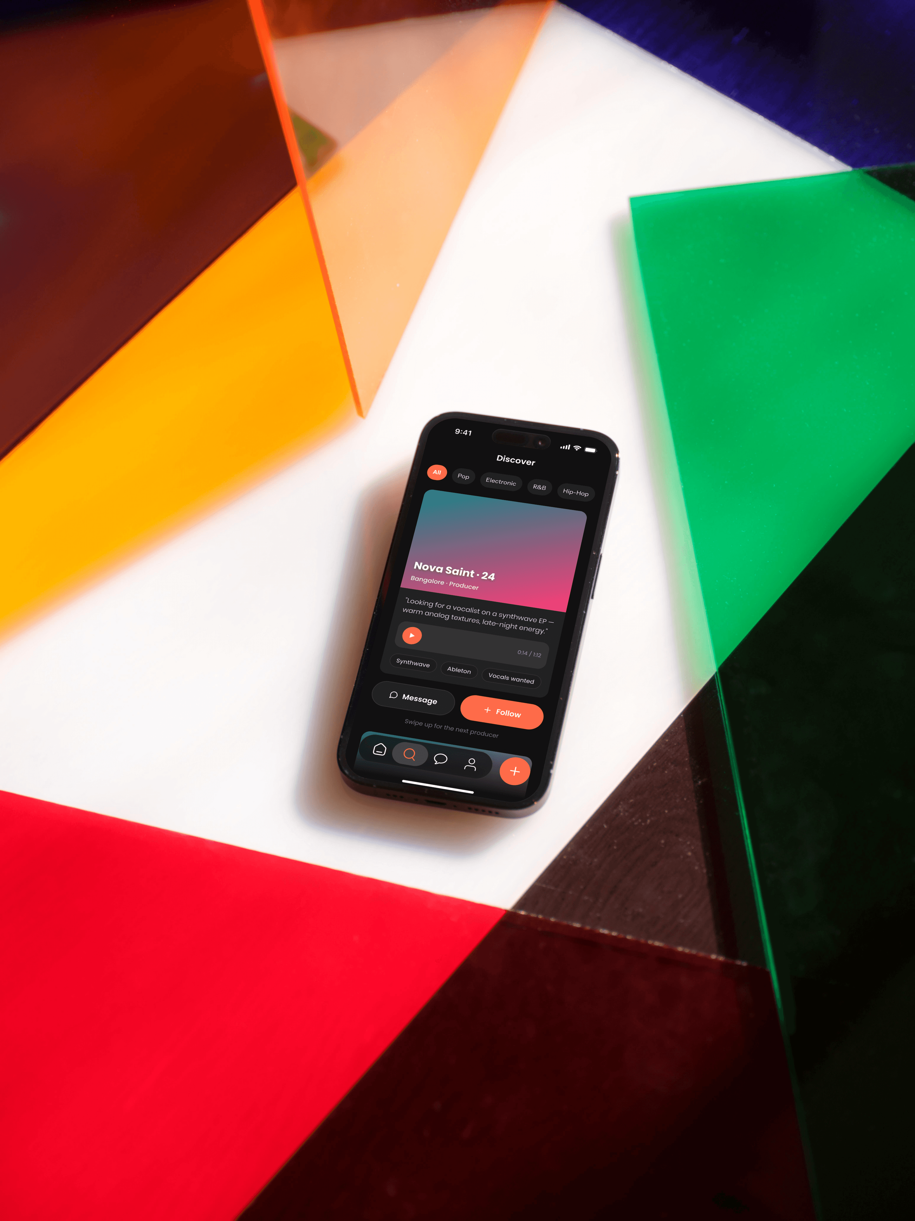
I didn't use color just for brand. Each genre in the discovery feed has its own color chip, Pop is pink, Electronic is blue, Hip-Hop is green, Lo-Fi is yellow, Indie is cyan. This turns the feed into something visually scannable in under two seconds, and it was the change that reduced task completion time for "find a collaborator in your genre" by roughly 40% in informal testing.
I didn't use color just for brand. Each genre in the discovery feed has its own color chip, Pop is pink, Electronic is blue, Hip-Hop is green, Lo-Fi is yellow, Indie is cyan. This turns the feed into something visually scannable in under two seconds, and it was the change that reduced task completion time for "find a collaborator in your genre" by roughly 40% in informal testing.
Key Flows
Key Flows
Onboarding & profile setup
Onboarding & profile setup
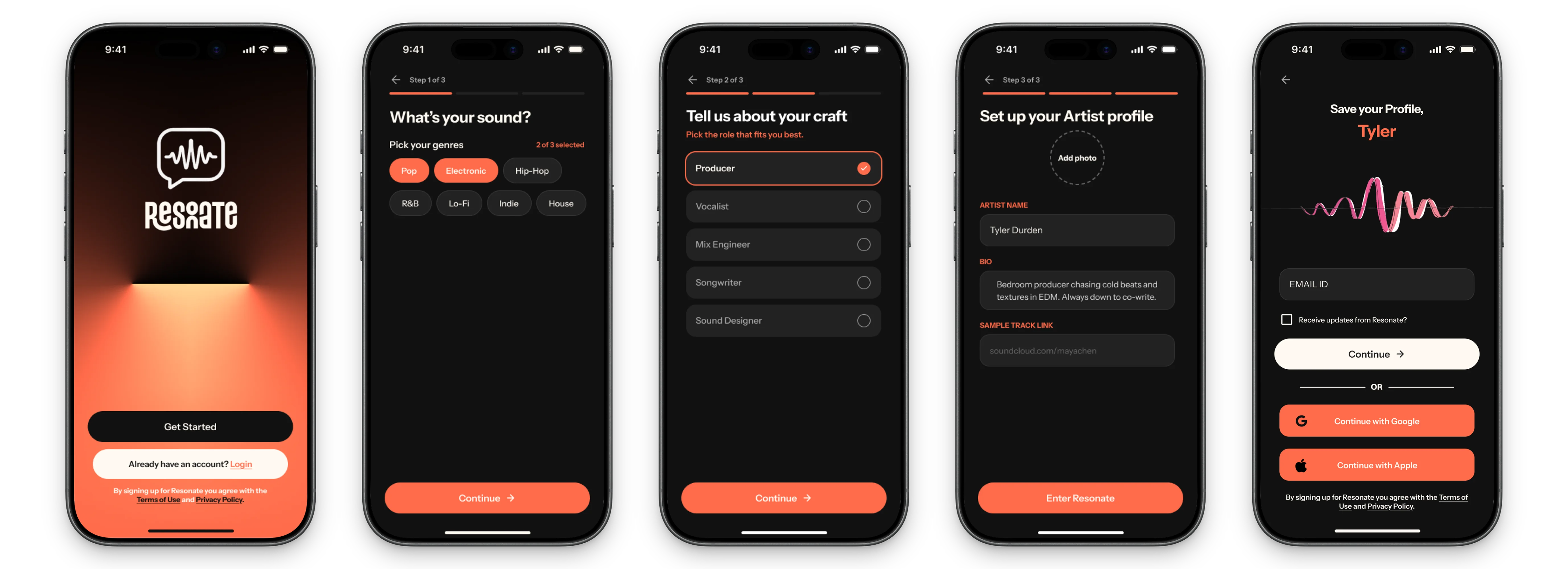
Genre selection, role selection (Producer / Vocalist / Composer / Sound Designer), profile creation. No jargon, no lengthy setup — pick your sound, define your role, and start discovering.
Genre selection, role selection (Producer / Vocalist / Composer / Sound Designer), profile creation. No jargon, no lengthy setup — pick your sound, define your role, and start discovering.
Discover Feed
Discover Feed
A genre-filterable feed of creator cards. Color-coded chips for instant visual scanability. Tap a card to hear a track preview, expand to see full profile, send a collaboration request in one tap.
A genre-filterable feed of creator cards. Color-coded chips for instant visual scanability. Tap a card to hear a track preview, expand to see full profile, send a collaboration request in one tap.

What I learned
The hardest complexity to remove is the kind that feels necessary.
The hardest complexity to remove is the kind that feels necessary.
One of the biggest challenges in this project was deciding what to remove. Features like version numbers, file names, and comment threads are useful, but they don't always belong in a creative collaboration tool. Every decision was made around the needs of a creator working in a fast-paced session, where speed and clear communication matter more than feature density.
I also learned that designing for musicians is about more than dark themes and waveforms. Creators quickly notice when an interface doesn't feel authentic. The visual system becomes part of the product's credibility, shaping whether users trust it with their work. Good design for creative tools understands how musicians think, collaborate, and build trust—and reflects that in every interaction.
One of the biggest challenges in this project was deciding what to remove. Features like version numbers, file names, and comment threads are useful, but they don't always belong in a creative collaboration tool. Every decision was made around the needs of a creator working in a fast-paced session, where speed and clear communication matter more than feature density.
I also learned that designing for musicians is about more than dark themes and waveforms. Creators quickly notice when an interface doesn't feel authentic. The visual system becomes part of the product's credibility, shaping whether users trust it with their work. Good design for creative tools understands how musicians think, collaborate, and build trust—and reflects that in every interaction.
Key Decisions
Designing for musicians isn't about adding waveforms and dark backgrounds. It's about understanding how creative people think, communicate, and build trust — and then designing a system that speaks that language fluently.
Designing for musicians isn't about adding waveforms and dark backgrounds. It's about understanding how creative people think, communicate, and build trust — and then designing a system that speaks that language fluently.