PAYTM REDESIGN
2024

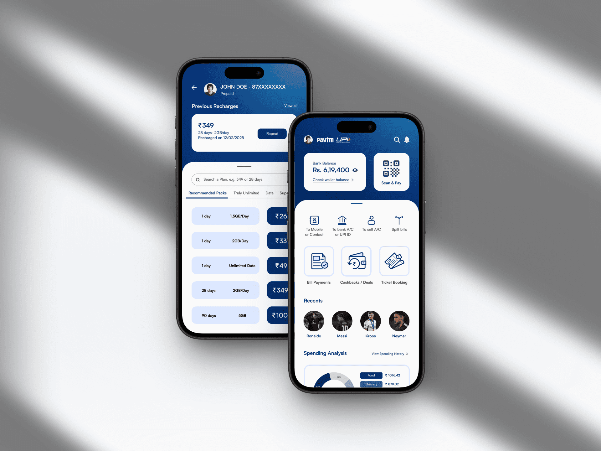
The project focused on conducting a UX audit of the Paytm app, evaluating the usability of key pages such as Home, Payments, Recharge, and Offers, and identifying areas for improvement in layout, navigation, and overall user experience.
The goal was to enhance ease of use, visual hierarchy, and interaction flow without disrupting the existing brand identity.
Process
Research: Conducted an in-depth heuristic analysis of Paytm’s core features. assessed issues related to information overload, inconsistent iconography, redundant pathways, and cluttered interface hierarchy.
Information Architecture & User Flow: Redefined the app’s information structure to simplify access and reduce cognitive load.
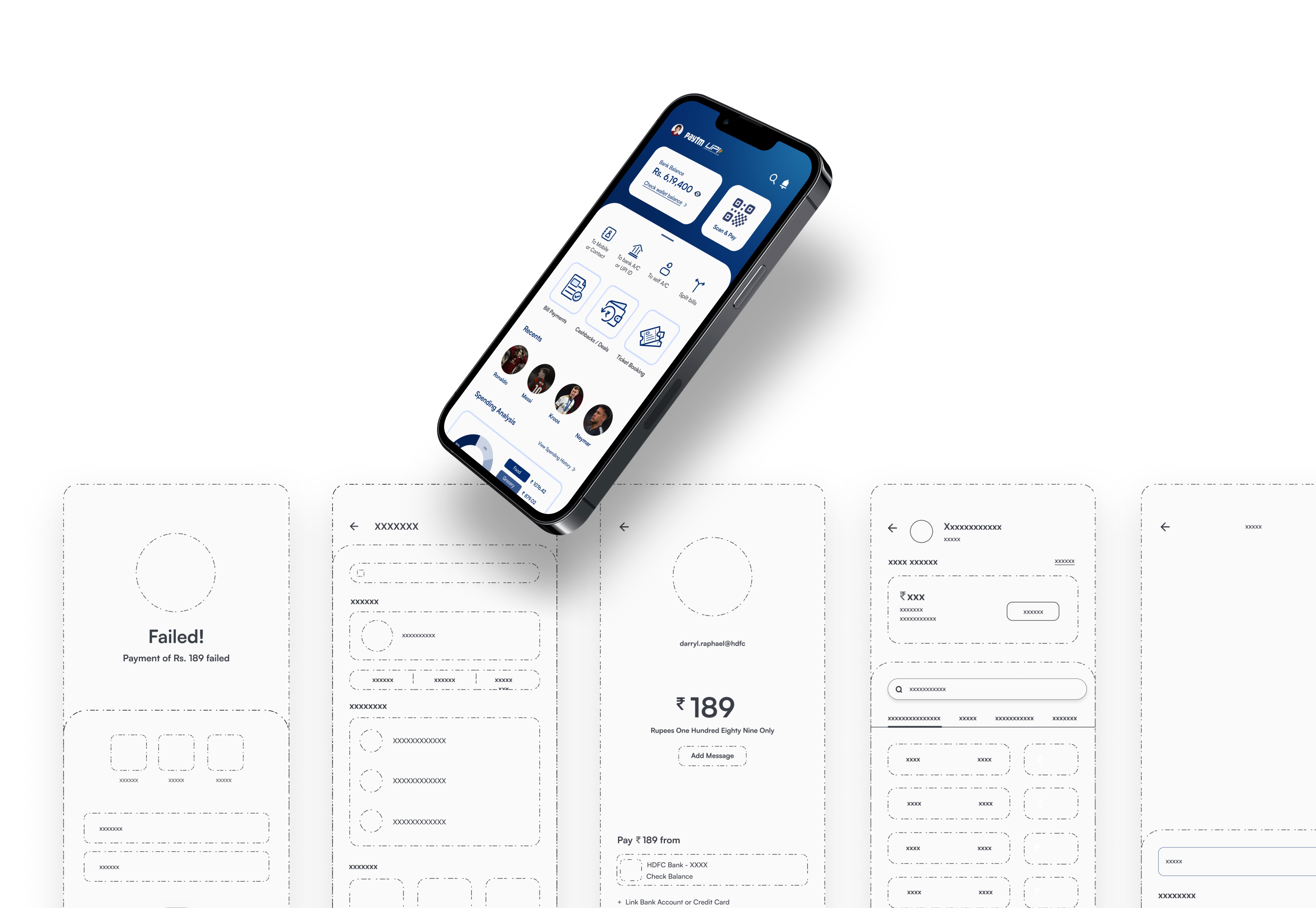
Mapped new user flows for common actions like:
Sending or receiving money
Mobile recharge
Bill payments
Checking offers or cashback
Each flow was optimized to minimize steps and remove unnecessary friction points, resulting in a cleaner, more guided user experience.
Wireframing: Created low-fidelity wireframes to visualize new layouts emphasizing usability and readability. Progressed to mid-fidelity prototypes focusing on navigation and task completion efficiency.
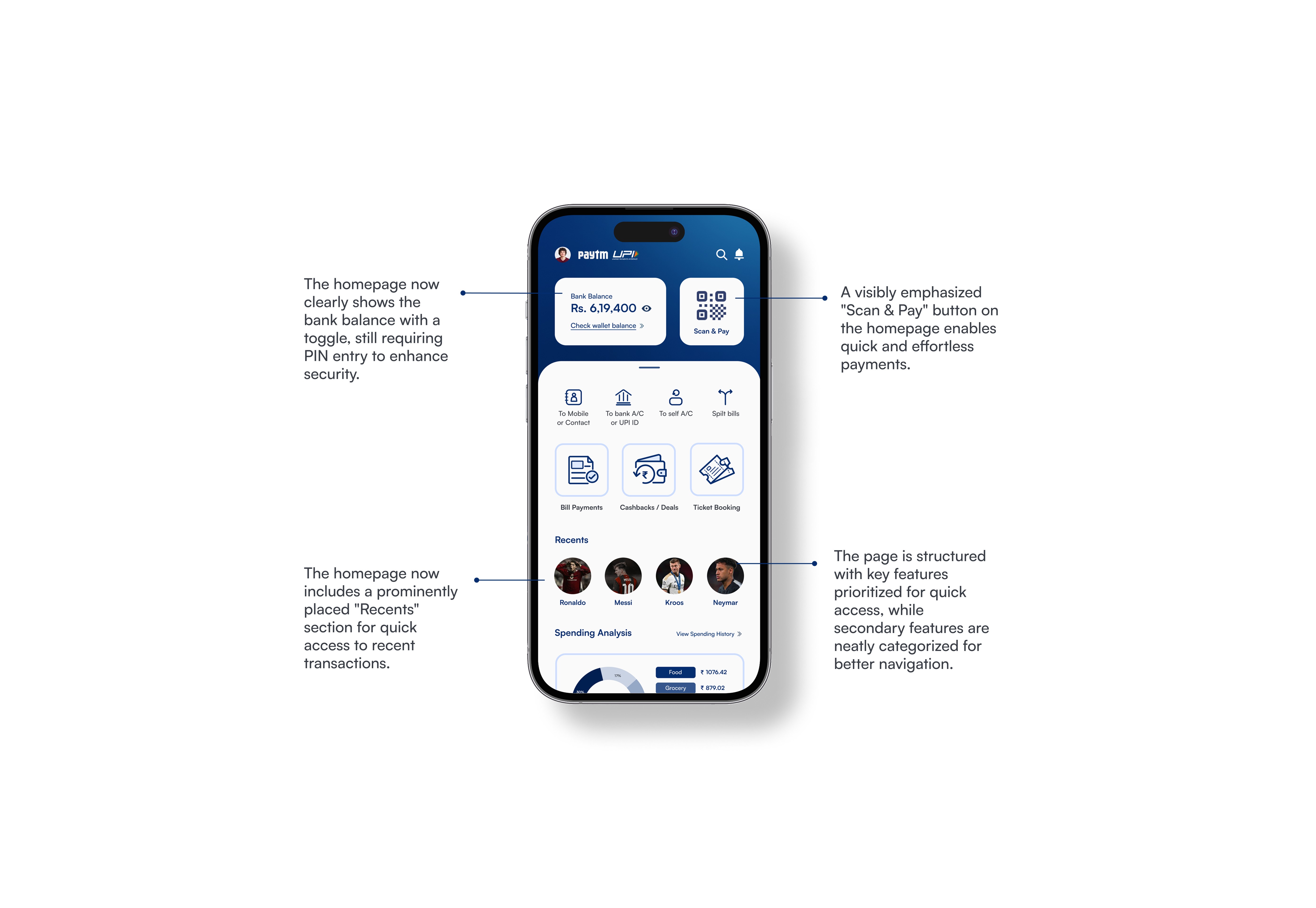
Visual Design & UI Refinement: Maintained Paytm’s recognizable blue-and-white color palette for brand consistency while introducing more breathing space, balanced typography, and cleaner iconography to reduce visual noise. Adopted a modular card layout for clarity, enabling users to distinguish core functions from promotional content effortlessly.
Outcome
Delivered a streamlined and intuitive UI that emphasizes essential features first.
Enhanced visual hierarchy, readability, and task discoverability, while maintaining Paytm’s core brand feel. Annotated mockups showcased side-by-side comparisons of existing vs. improved designs, demonstrating measurable UX enhancement.
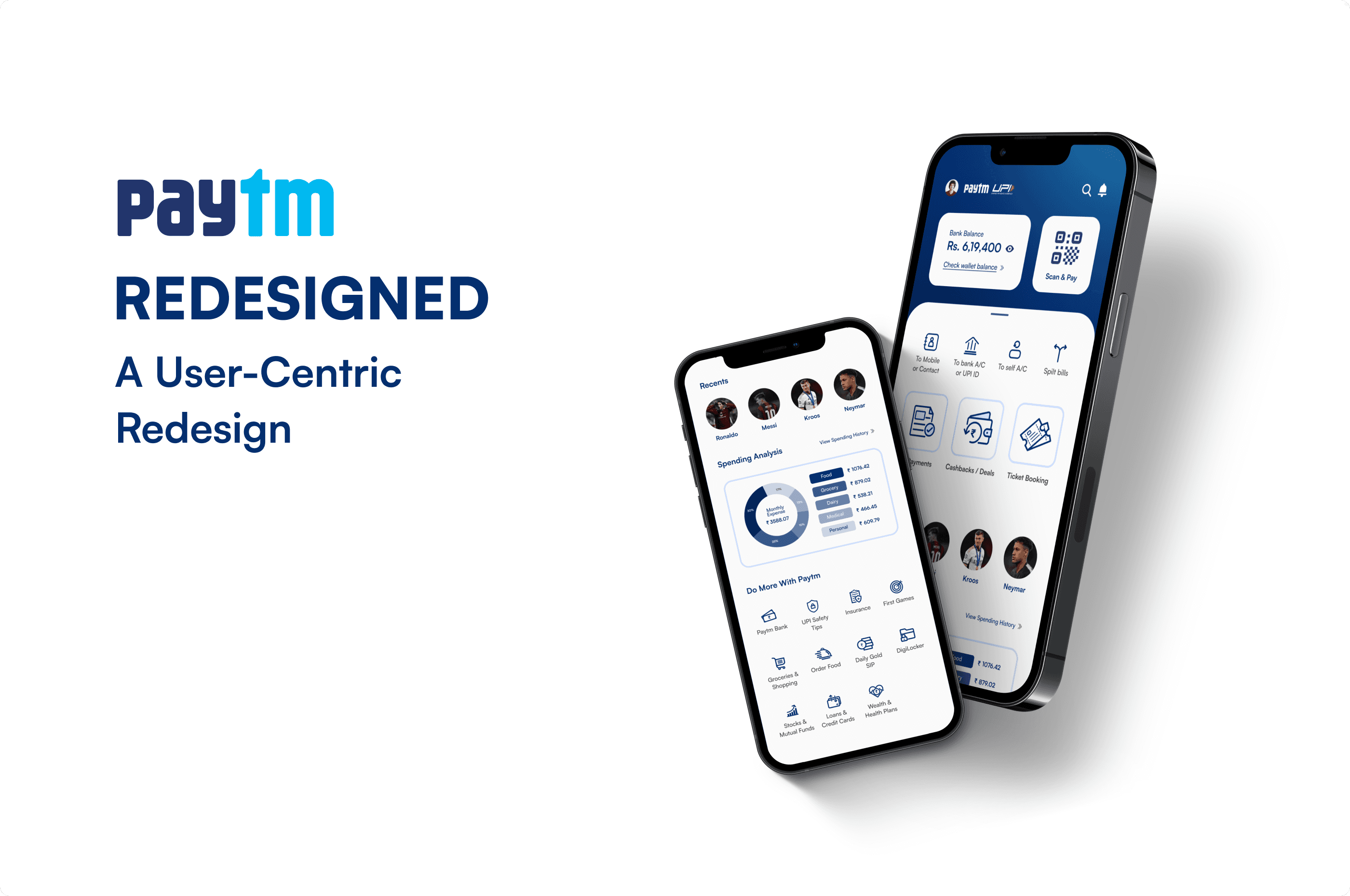
The redesign exercise balanced functionality with visual restraint ensured that Paytm’s usability improved without losing its brand identity.
Other cases