PetPulse
PetPulse
PetPulse
Proactive Pet Healthcare App
Proactive Pet Healthcare App
Proactive Pet Healthcare App
Year
2026
Company
Interview Assignment
Category
UI/UX Design
Product Duration
4-Days

The Brief
Half the people who install never sign up. Half who sign up never open the community.
Half the people who install never sign up. Half who sign up never open the community.
This was a take-home design assignment given to me as part of an interview process at a pet healthcare startup. The brief was built around a real product: an AI care companion that answers pet-care questions with guidance personalized to your specific dog: its breed, age, weight, and history.
The two problems were presented with approximate product metrics. 60% of new installs were never converting into accounts, and drop-off was concentrated at authentication itself. On the community side, roughly half of signed-up users never opened it at all, and those who did almost never posted. I had 4-Days to redesign both flows and present my reasoning.
This was a take-home design assignment given to me as part of an interview process at a pet healthcare startup. The brief was built around a real product: an AI care companion that answers pet-care questions with guidance personalized to your specific dog: its breed, age, weight, and history.
The two problems were presented with approximate product metrics. 60% of new installs were never converting into accounts, and drop-off was concentrated at authentication itself. On the community side, roughly half of signed-up users never opened it at all, and those who did almost never posted. I had 4-Days to redesign both flows and present my reasoning.

Approach
I moved sign-up from a gate to a reward.
I moved sign-up from a gate to a reward.
The root issue wasn't the sign-up form itself, it was its positioning. Users were being asked to authenticate before they'd experienced a single moment of value. No one signs up for something they haven't seen work yet. So instead of redesigning the form, I redesigned the order.
On first open, a user can ask PetPulse a question immediately. A lightweight inline prompt (breed, age, weight) appears as a nudge, not a requirement. Skip it and you get a general answer. Fill it in and the answer is personalized to your actual dog. Sign-up only appears once the user has something to lose by not continuing.
The root issue wasn't the sign-up form itself, it was its positioning. Users were being asked to authenticate before they'd experienced a single moment of value. No one signs up for something they haven't seen work yet. So instead of redesigning the form, I redesigned the order.
On first open, a user can ask PetPulse a question immediately. A lightweight inline prompt (breed, age, weight) appears as a nudge, not a requirement. Skip it and you get a general answer. Fill it in and the answer is personalized to your actual dog. Sign-up only appears once the user has something to lose by not continuing.
Key Decisions
No login wall before value. A question-first entry means users experience the product's actual promise before being asked for anything. Every CTA before sign-up is designed to reduce friction, not enforce it.
One focused nudge instead of a 5-step onboarding. Instead of walking new users through a long dog profile setup upfront, the app collects only breed, age, and weight — the minimum needed to personalize an Everwiz answer — in a single inline step they can skip.
Auth fallback built in. If the magic link fails or doesn't arrive, a prominent "Get a 6-digit code instead" option appears automatically — no dead end, no confused user closing the app.
No login wall before value. A question-first entry means users experience the product's actual promise before being asked for anything. Every CTA before sign-up is designed to reduce friction, not enforce it.
One focused nudge instead of a 5-step onboarding. Instead of walking new users through a long dog profile setup upfront, the app collects only breed, age, and weight — the minimum needed to personalize an Everwiz answer — in a single inline step they can skip.
Auth fallback built in. If the magic link fails or doesn't arrive, a prominent "Get a 6-digit code instead" option appears automatically — no dead end, no confused user closing the app.
The Flow Logic
The Flow Logic
The sign-up wall moves to where the user has something to lose.
The sign-up wall moves to where the user has something to lose.
The key visual moment is the Everwiz answer screen — and it does two jobs at once. Below the answer, a small community nudge appears: "12 Labrador parents asked about a similar rash this week." This ties the community directly to Everwiz content rather than leaving it as a separate destination the user has to discover on their own.
The community itself is segmented by breed and life stage from the start, so a first-time visitor lands on a feed that's actually relevant to them. Vet-curated threads are seeded into every segment so new users never see a blank room. And rather than a blank composer as the default entry point, the community surfaces a low-effort structured prompt — a one-tap poll or reaction — before asking anyone to write a full post.
The key visual moment is the Everwiz answer screen — and it does two jobs at once. Below the answer, a small community nudge appears: "12 Labrador parents asked about a similar rash this week." This ties the community directly to Everwiz content rather than leaving it as a separate destination the user has to discover on their own.
The community itself is segmented by breed and life stage from the start, so a first-time visitor lands on a feed that's actually relevant to them. Vet-curated threads are seeded into every segment so new users never see a blank room. And rather than a blank composer as the default entry point, the community surfaces a low-effort structured prompt — a one-tap poll or reaction — before asking anyone to write a full post.

Key Flows
Key Flows
Activation Flow
Activation Flow
First open lands on a home screen where existing users can log in, but first-time users can start immediately without one. After asking a question, the app gently prompts for breed, age, and weight with a clearly visible skip option. Skipping returns a general answer; filling it in returns a personalized one with a note on what made it specific to their dog. A community nudge sits below the answer — not as a redirect, but as a connection: other parents who asked the same thing. All sign-up CTAs across the community and save flows lead to a single bottom-sheet with three auth options, a magic link warning, and an automatic OTP fallback.
First open lands on a home screen where existing users can log in, but first-time users can start immediately without one. After asking a question, the app gently prompts for breed, age, and weight with a clearly visible skip option. Skipping returns a general answer; filling it in returns a personalized one with a note on what made it specific to their dog. A community nudge sits below the answer — not as a redirect, but as a connection: other parents who asked the same thing. All sign-up CTAs across the community and save flows lead to a single bottom-sheet with three auth options, a magic link warning, and an automatic OTP fallback.
Before
Before

After
After
Community Flow
Community Flow
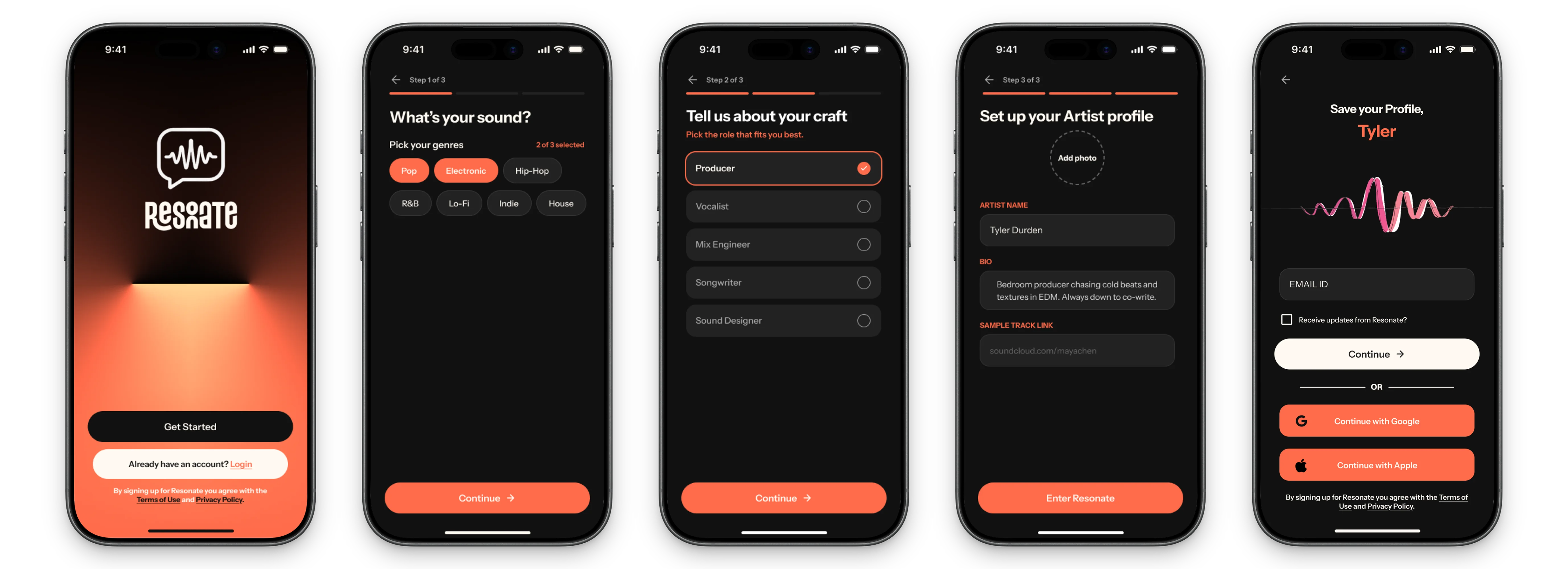
Users who tap the community nudge from the Everwiz screen land directly on a segmented feed filtered to their dog's breed and life stage. Vet-curated threads anchor the top of each feed so it never looks empty. First-time contributors see a structured prompt — "Does your dog get itchy in summer?" with one-tap answer options — before they're ever shown a blank composer. Once they post, a response from an experienced parent or the team follows within a committed window, so the first experience of contributing doesn't end in silence.
Users who tap the community nudge from the Everwiz screen land directly on a segmented feed filtered to their dog's breed and life stage. Vet-curated threads anchor the top of each feed so it never looks empty. First-time contributors see a structured prompt — "Does your dog get itchy in summer?" with one-tap answer options — before they're ever shown a blank composer. Once they post, a response from an experienced parent or the team follows within a committed window, so the first experience of contributing doesn't end in silence.
Before
Before

After
After
What I learned
The hardest complexity to remove is the kind that feels necessary.
The hardest complexity to remove is the kind that feels necessary.
The community half taught me the same thing about cold start. Badges, streaks, and gamification mechanics don't fix an empty room — they just give people more visible proof of how empty it is. What actually breaks the loop is a guaranteed reply and a feed that looks alive from day one, even if you have to manually seed it to get there.
The community half taught me the same thing about cold start. Badges, streaks, and gamification mechanics don't fix an empty room — they just give people more visible proof of how empty it is. What actually breaks the loop is a guaranteed reply and a feed that looks alive from day one, even if you have to manually seed it to get there.
This project was completed as a 4day design assignment during an interview process. All metrics in the brief were provided by the company. The design decisions and solutions are entirely my own.
This project was completed as a 4day design assignment during an interview process. All metrics in the brief were provided by the company. The design decisions and solutions are entirely my own.